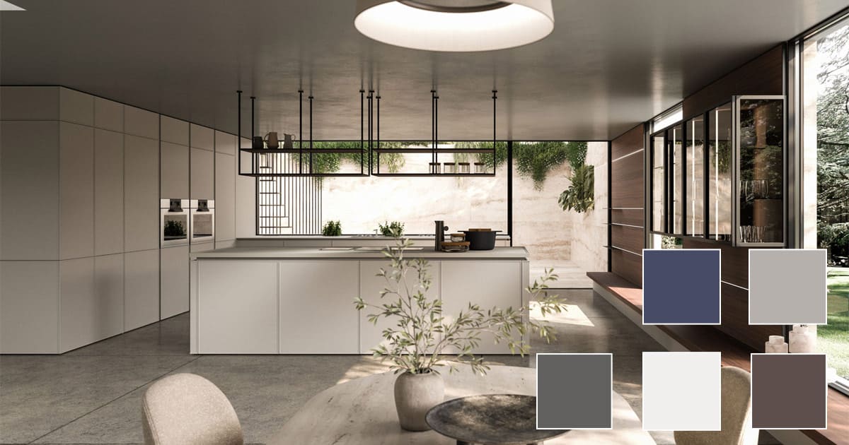
Color Trends 2025/2026: A new vision of Design according to Snaidero America
As global conversations around design continue to evolve, color remains one of the most powerful tools for expressing creativity, innovation, and emotion within a home. While the Pantone® Fashion Colour Trend Report highlights the tones shaping the world of fashion, the same chromatic influences increasingly define the future of interior design.
At Snaidero America, color is more than an aesthetic choice. It is a design philosophy, an intentional balance between timeless elegance, modern expression, and the architectural integrity of Italian-crafted kitchens and living spaces. The upcoming 2025/2026 trends resonate deeply with the brand’s commitment to refined finishes, luxury craftsmanship, and environments that feel both contemporary and personal.
A Palette that redefines Luxury in the home
The color vision for 2025/2026 embraces a duality between familiarity and experimentation. Warm neutrals coexist with bolder, more expressive hues, reflecting a renewed desire to personalize the home in meaningful and authentic ways. This balance mirrors Snaidero America’s own design approach: harmonizing iconic Italian style with a modern sensibility tailored to North American homes.
These color stories, rich earth tones, atmospheric blues, nature-inspired greens, and delicate off-whites, pair seamlessly with Snaidero’s selection of premium finishes, including:
- matte or high-gloss lacquer
- brushed metallics
- natural wood veneers
- stone-inspired surfaces
- contemporary laminates and textured materials
Whether used for cabinetry, integrated wall systems, or custom vanities, color becomes a fundamental layer in shaping how a space feels, functions, and evolves.
Top color directions for 2025/2026 and how they translate into Interior Design
Below is an adaptation of the season’s major chromatic influences, reinterpreted through the lens of Snaidero America’s luxury craftsmanship.
Lavender Blue – Soft Modernity
An airy, lilac‑tinted blue that brings peace and clarity to interiors. Ideal for enhancing open-concept living rooms or adding a gentle contrast to neutral kitchen palettes, this tone pairs beautifully with matte whites, light wood, and brushed metallic accents.
Desert Sun – Warm, Sculptural Elegance
Deep orange with warm brown undertones, this color introduces a sophisticated organic warmth. In Snaidero interiors, it complements walnut finishes, bronze metallics, and stone-inspired worktops, creating environments that feel rooted yet refined.
Poppy Red – Bold Expression
A vibrant, celebratory red that makes a confident statement. Used selectively, such as on an accent wall, shelving detail, or décor element, it brings energy to minimalist Italian kitchens and modern living areas.
Magical Forest – Deep Woodland Green
An enigmatic, luxurious green that resonates with the trend toward nature-inspired interiors. It creates a striking contrast when paired with dark woods, smoked glass, or satin metallic finishes.
Salted Lime – Fresh and Playful
A lively, acidic green that introduces a sense of spontaneity. Best used in small doses to energize kitchen backsplashes, curated accessories, or open shelving compositions.
Hot Chocolate – Cozy Sophistication
The ultimate comfort shade. This rich brown tone enhances warm-toned kitchens, especially those featuring oak, walnut, or textured finishes from Snaidero America’s curated collections.
Fanfare – Timeless Blue
An elegant blue that conveys confidence and stability, a natural fit for modern wall systems and integrated storage where subtle drama is desired.
Chili Oil – Strong and Seasonless
A bold red with depth and character, perfect for clients who appreciate expressive contrast in otherwise neutral interiors.
Fig – Refined, Fruity Depth
A purple color touched with wood tones, ideal for accents or layered monochromatic schemes.
Bronze Mist – Metallic Luxury
A warm metallic brown that introduces subtle radiance without overpowering the design. Perfectly aligned with Snaidero America’s metallic finishes and accessorized details.
All‑Season Shades: The New Neutrals of Italian Design
Beyond the Top Ten, the all‑season tones represent the foundation of many Snaidero America interiors. These colors reflect the brand’s emphasis on timelessness, longevity, and elegant restraint.
Wispy Clouds – Soft, Delicate White
A silky white that enhances natural light and pairs effortlessly with any finish in the Snaidero palette.
Dark Gull Gray – Understated Strength
A structured neutral that adds modernity to open living spaces and kitchen cabinetry.
Crown Blue – Classic Depth
Reliable and enduring, this blue complements both contemporary environments and transitional designs.
Cumulus Cloud – Natural Gray
A cotton-like, organic gray tone that enhances serene, minimalist interiors.
Chocolate Martini – Velvety Brown
A luxurious, fluid brown perfect for creating warmth in statement kitchens or lounge areas.
Color as a Design Tool: The Snaidero America Perspective
While Pantone defines seasonal inspiration, Snaidero America transforms these chromatic narratives into living, functional architecture. Through a combination of Italian craftsmanship and customizable finishes, homeowners can integrate these emerging color trends into:
- luxury kitchen cabinetry
- wall systems and media units
- integrated living space solutions
- custom vanities and bathroom environments
The result is a home that balances innovation, personality, and the unmistakable elegance of Italian design.
Color trends come and go, but exceptional design endures, and Snaidero America continues to offer the tools, materials, and expertise to craft spaces that are both timeless and deeply individual.
